
Gradify
Student Loan Management
Role: UX/Product Designer | Team: #DWKQ | Duration: Jan 2024 - April 2024 | Tools: Figma
Background
My teammates and I created Gradify as part of our UX Mastery Course at University of Michigan. Through initial discovery, we found that student loan borrowers experience friction in managing their loans due to a financial literacy gap.
43.2 million Americans
Have federal student loans
Goal
Support these borrowers throughout their entire student loan journey including stages before attending school, while in school, and post-graduation
Research
9 out of 10 users
Experience confusion around financial
terminology included in loan applications
Approx 70%
Report budgeting as the main
obstacle in student loan management
System Process Flow
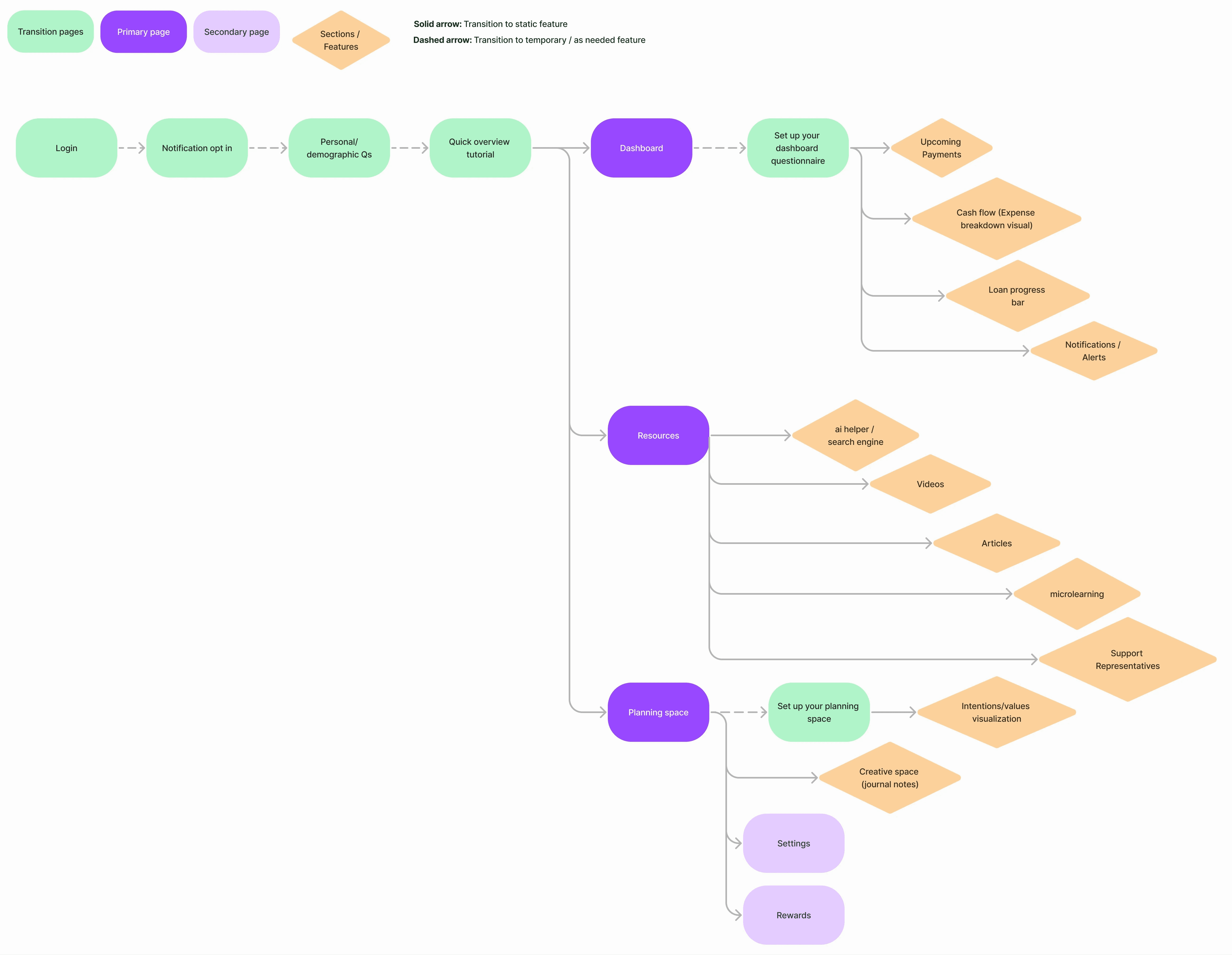
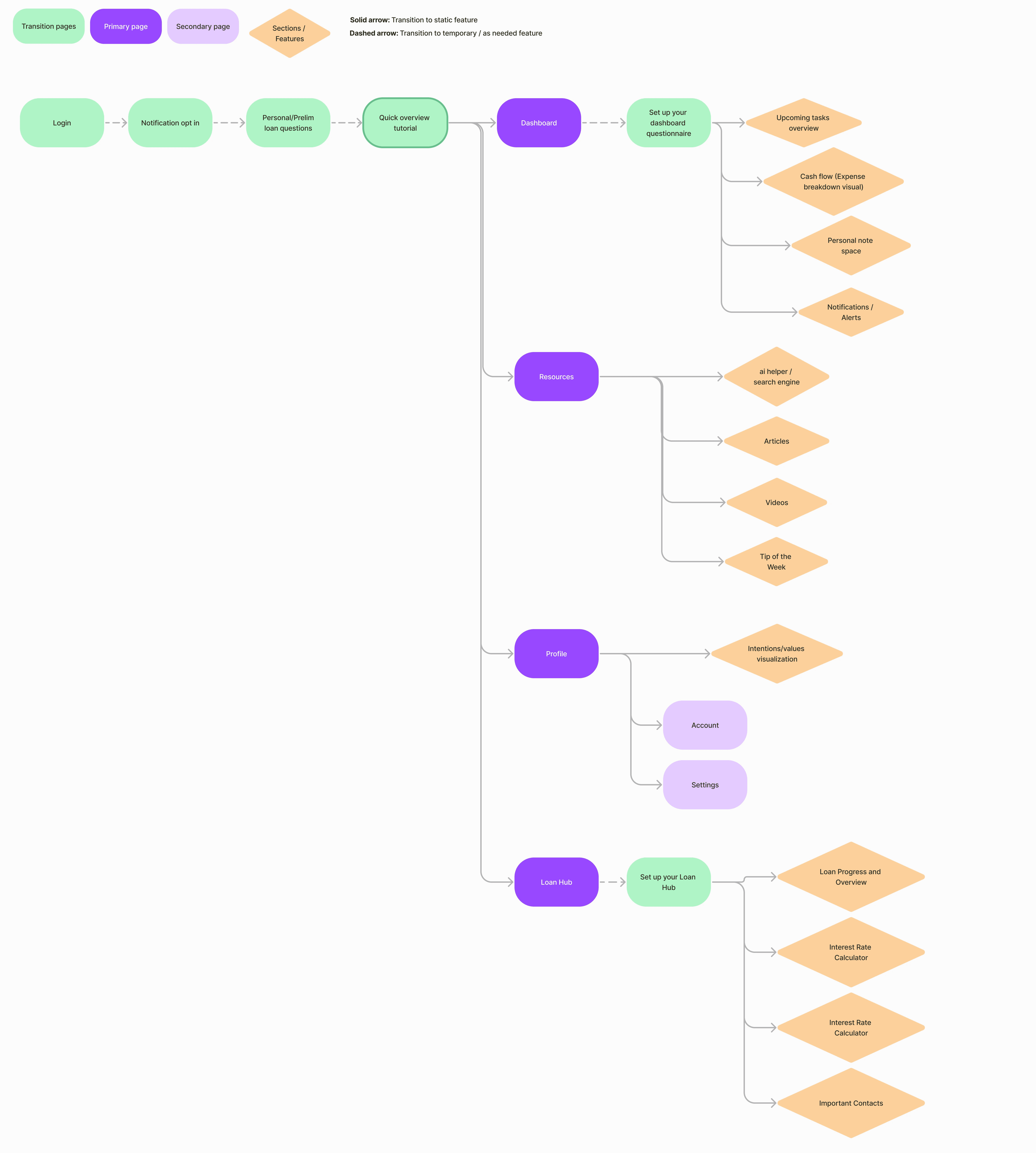
As we began to think about what features would add the most value to our users, we outlined a flow to reflect the information hierarchy and prominent screens within the app. As time went on and we received more insights from users, this flow evolved. Initially, our user interviews displayed the need for heavy budgeting tools and we reflected that within our first iteration. However, once we received survey results and tested the low-fidelity screens, we realized that we needed to go back to the drawing board as the architecture and depth of loan information was insufficient to our users.
This first iteration of the flow placed more emphasis on budgeting/habit tracking and microlearning
This final flow reduces emphasis on micro-learning and introduces the separation of the loan hub, in order to steer away from general budgeting
Design Decisions
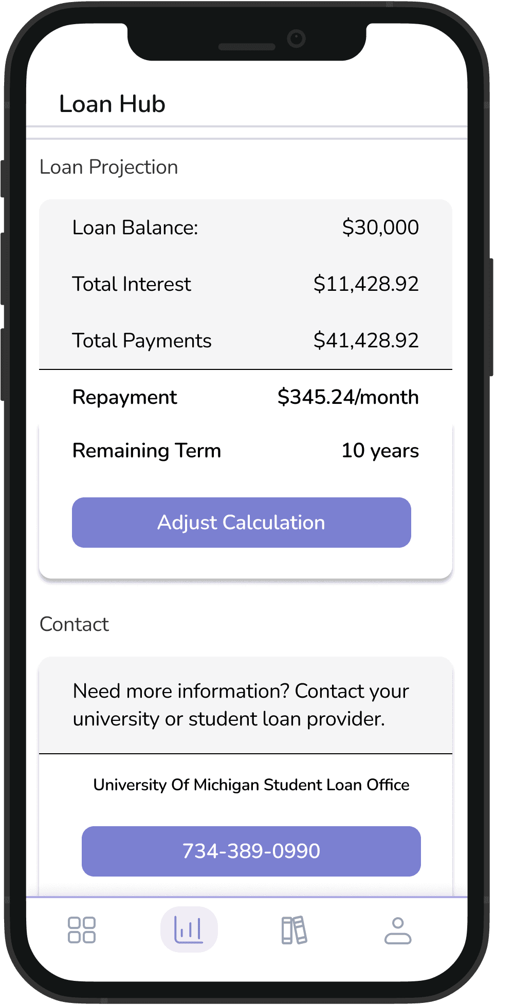
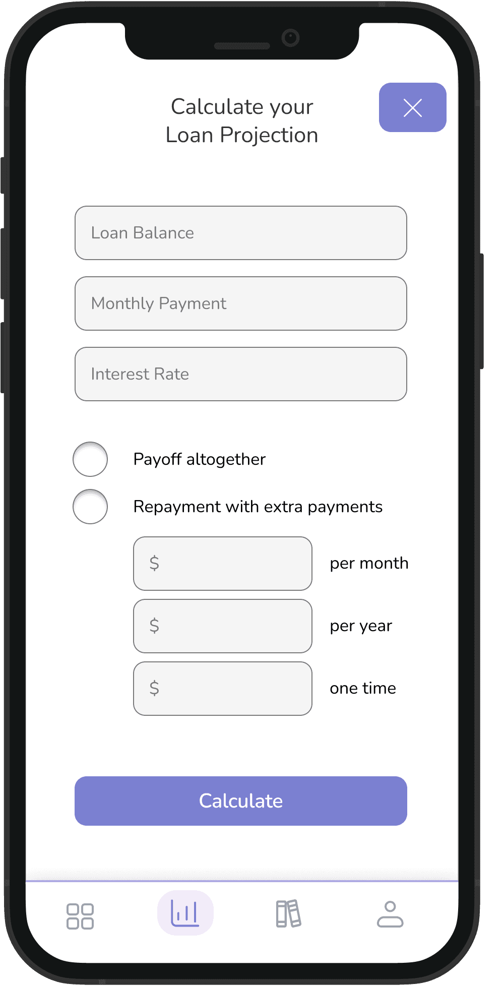
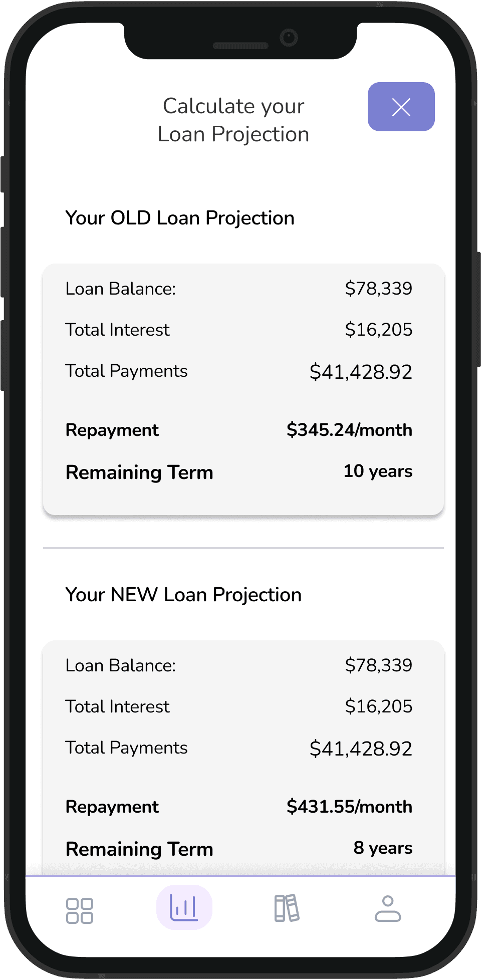
Interest Calculator
53% of users stated having difficulties understanding how interest rates work
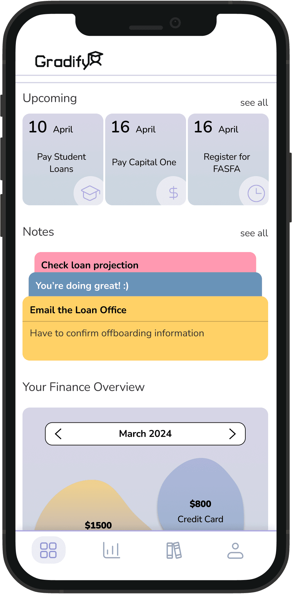
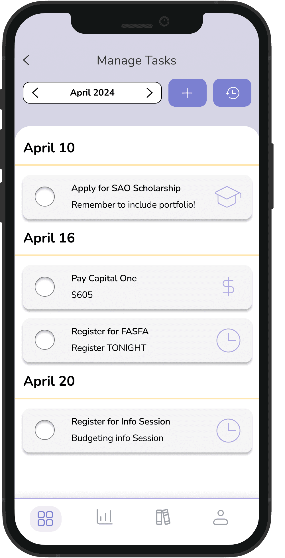
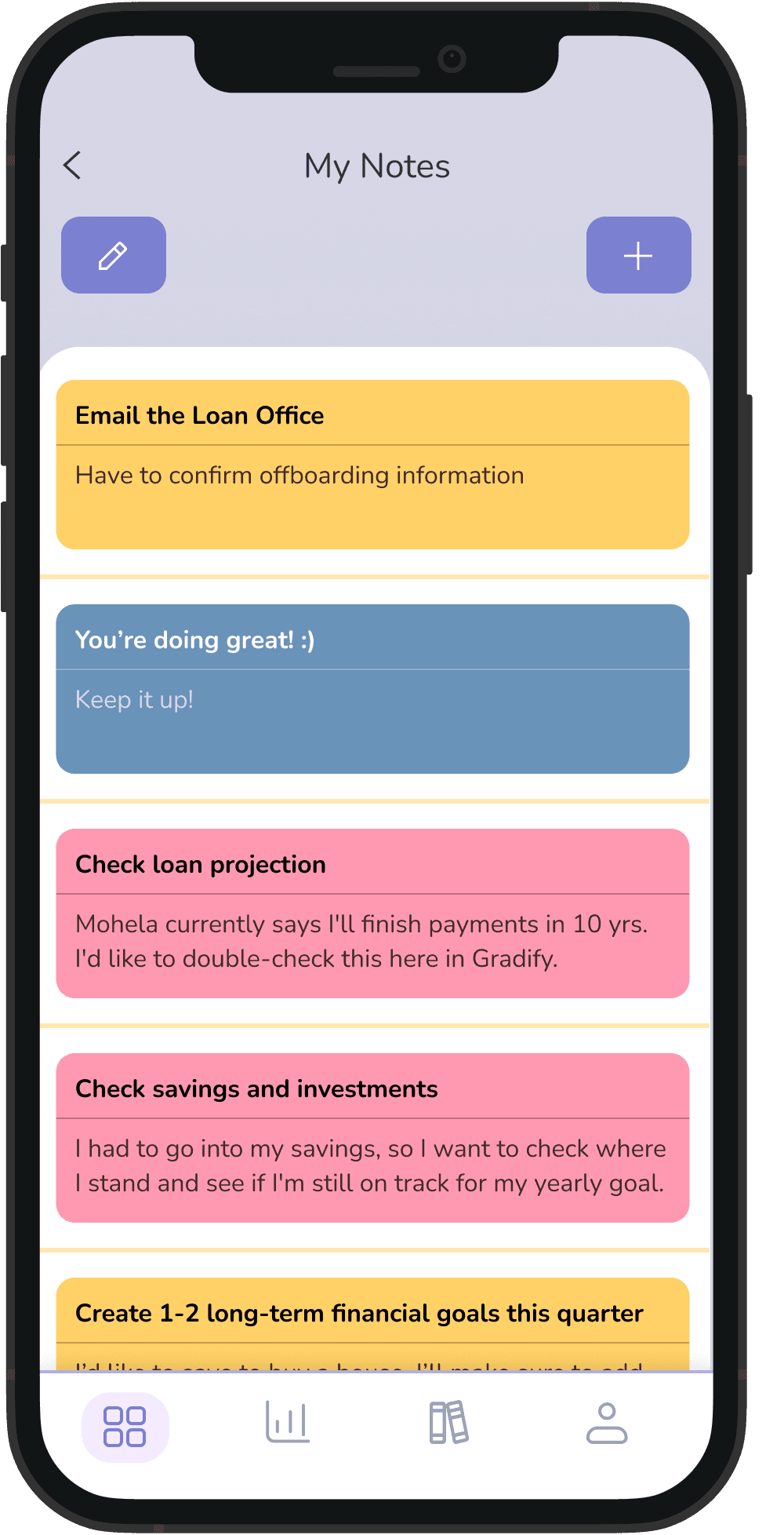
Note-taking and Deadlines/Reminders
60% of respondents manually check loan provider websites to stay updated
43% of users budget by memory or using informal methods (note-taking, journaling)
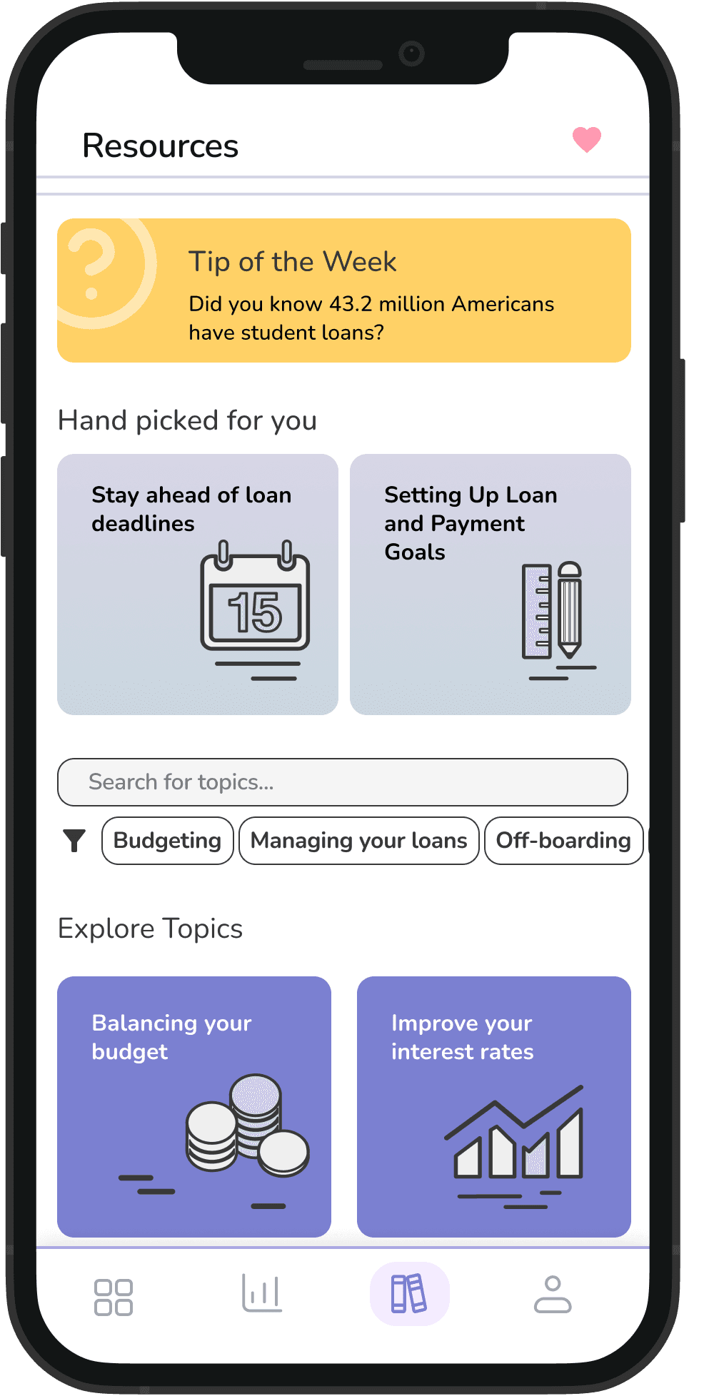
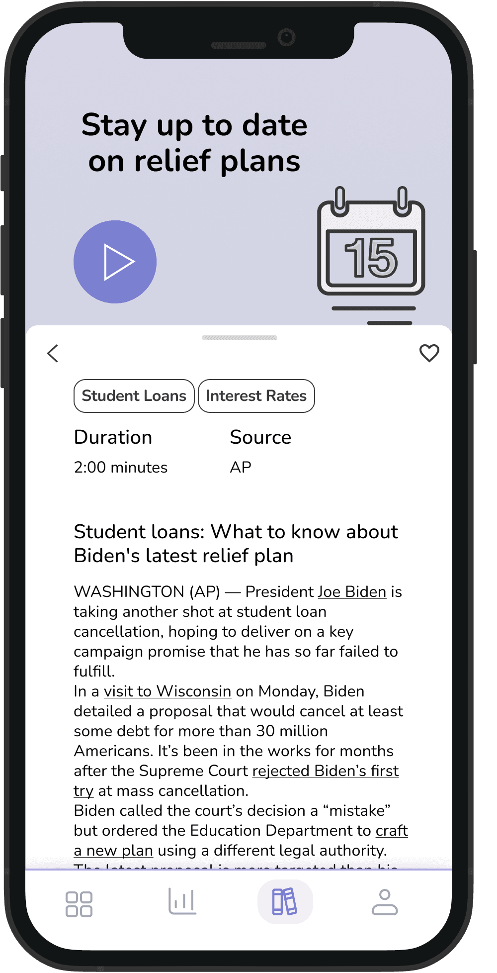
Resources
9 out of 10 users find it difficult to understand financial terminology
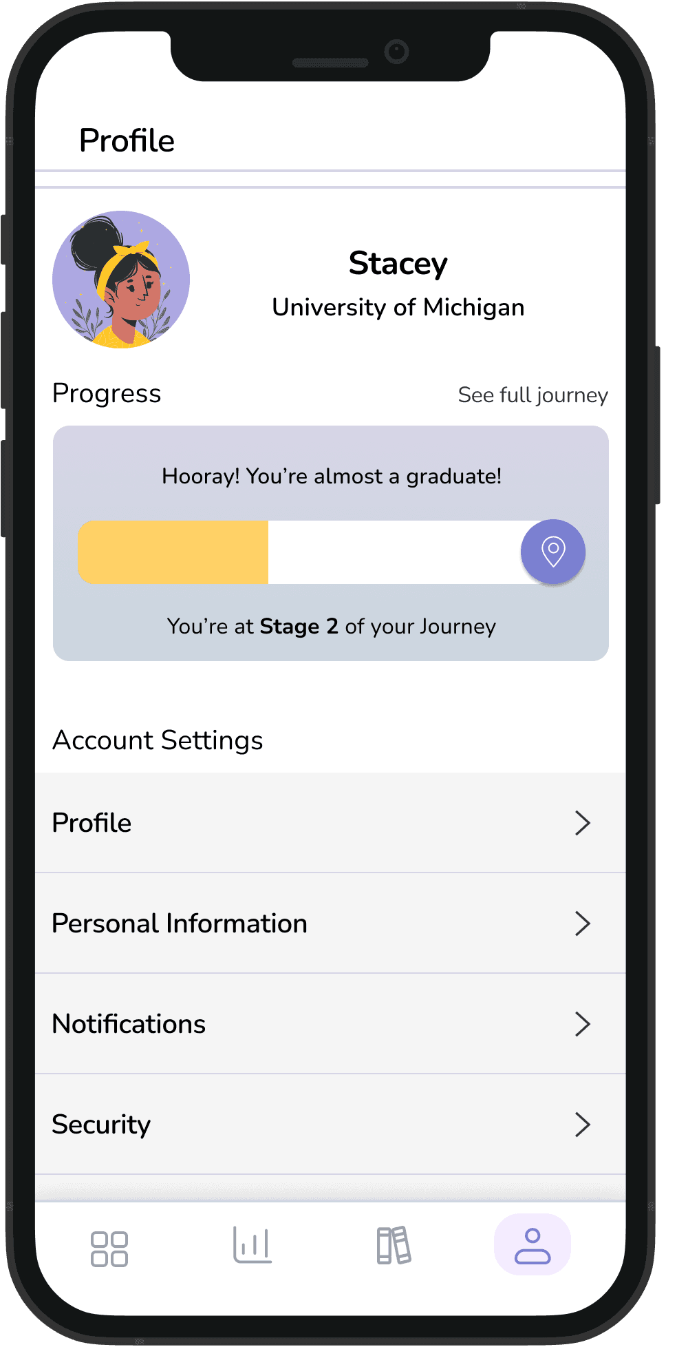
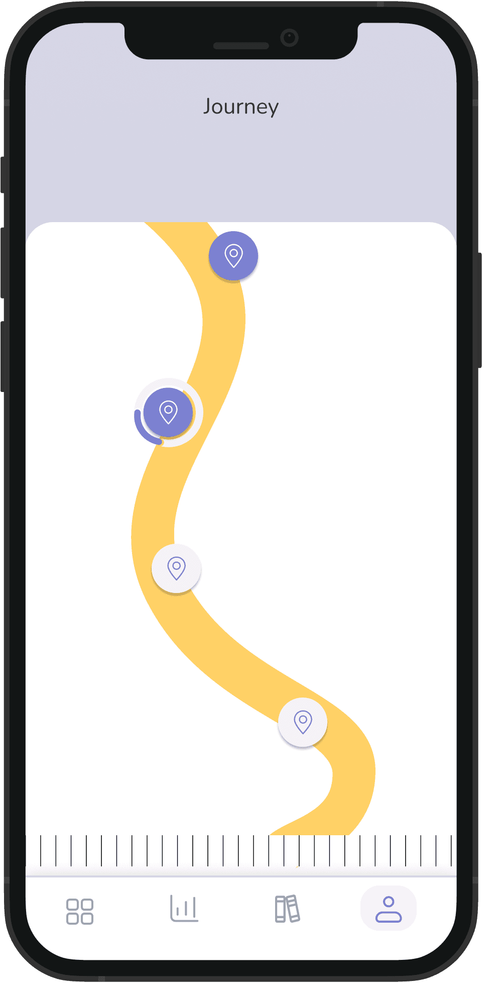
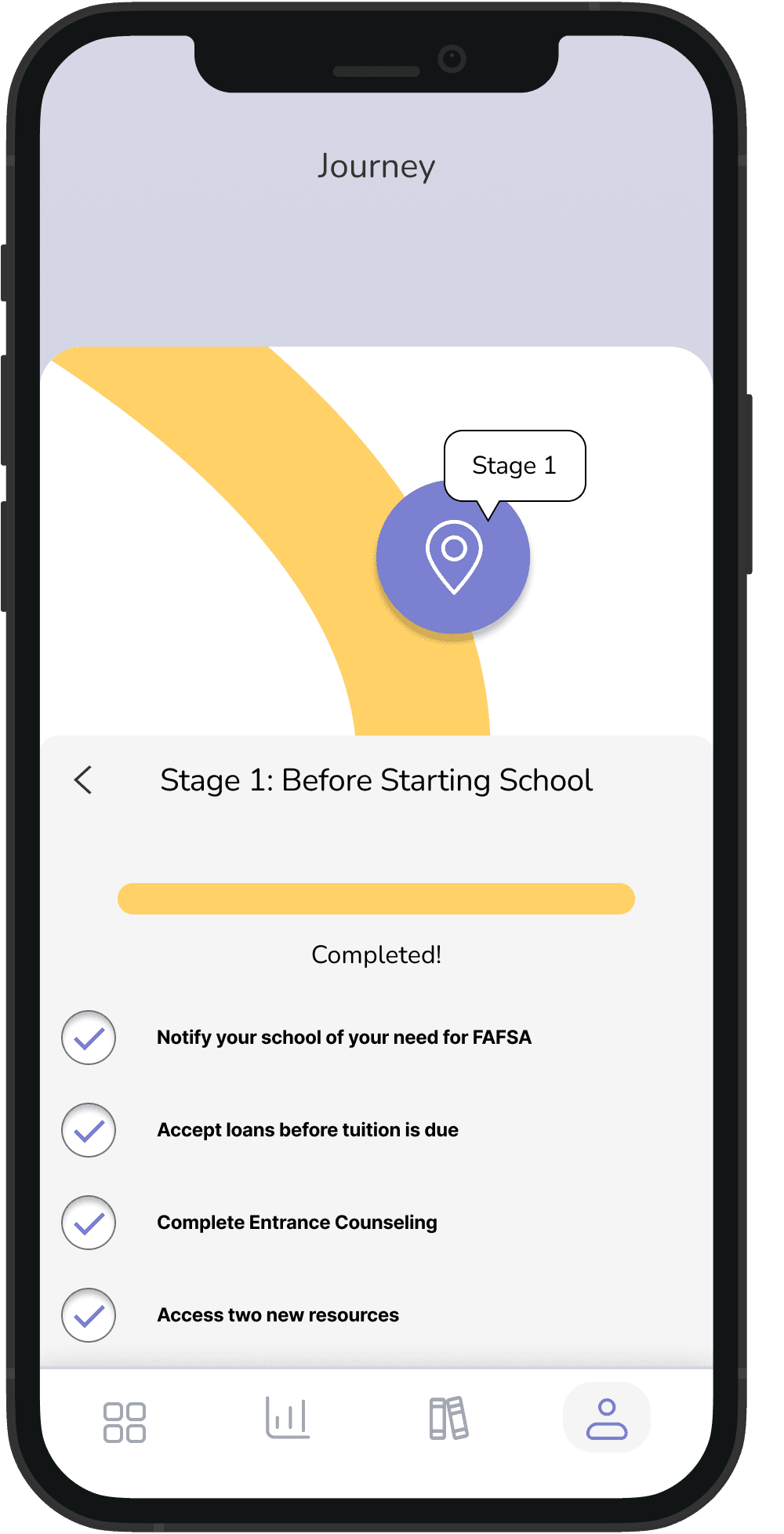
Journey in Profile
Allowing students to see their progress and tangible goals
Final Product
Learnings
Iterate, iterate, iterate: My fellow designer on this project, Whitney, and I spent hours going back to the drawing board in order to play around with visual structure and information architecture. While yes this took a lot of time, it made our final product stronger and something that we are proud of!
Save all your designs. Including the ugly ones. It was fun to return to our screens that ended up in the graveyard section of the Figma file - this helps visualize the full design journey and also it can be valuable to see your own progression as a designer.
I also realized during this project that I thrive in the ideation stage; I love turning data into actionable design considerations and I hope to bring that strength to my next role!
